
Mercy Unveils Fresh and Sleek New Look
Fresh. Clean. Sleek. This describes Mercy College’s new rebrand.
The new look of Mercy College can already be seen on its web page, and it possesses a cleaner and more vibrant look than in previous years. Catherine Cioffi, Director of Public Relations and Marketing, gave some insight on the new project and the main theme of the rebrand.
“It’s celebrating the grit of our students – celebrating who our students are, what they’ve overcome to get here, and what they have to go through while they’re here.”
The decision to rebrand the school’s look began last year.
“The college community started to look at our messaging and how we talk about ourselves, and who we are. We noticed that it was all very generic and it didn’t tell the college’s story the full way it could.”
Mercy College collaborated with Siegel Vision out of New York City to help create the process and gain some insight on the new message it wanted to portray.
“ They started examining the college and determined how it would be best to display who we are and how we can we tell our story while celebrating our students.”
Cioffi and her team attended several events to gain more feedback for the new rebrand, and both had stellar results.
“We wanted to see the kind of feedback we were going to get. We went to Albany and WCBS Small Business Breakfast in Tarrytown.”
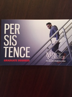
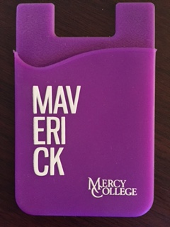
Mercy’s font, photos and advertisements are different from those of previous years. Different colors were used instead of the traditional blue and white. The pictures on the brochures are now attempting to capture the daily life of students. A new concept to the rebrand is words used to describe the students are stacked, written in a stacked sequence. Words like gritty, unstoppable, expressive, driven were used to describe the students at Mercy. Most of the new rebrand has been showcased on the school’s website.
Cioffi wanted to have moodier tones with the pictures and create some type of edge and city life to them.
“We’re going for photos that have moodier tones, something that captures that New York vibe. All of the photos will have some edginess to it.”
But there was something else Cioffi wanted to capture other than the moodier tones. In previous ads, there were pictures of students almost smiling, which isn’t always realistic. Cioffi and her team wanted to showcase something different, the actual transition in college. For example, a student going down the stairs or someone riding the train. Another example is a student looking outside the window on the subway.
“We also wanted to capture the transition that happens when you’re in college. College is not all smiles and giggles. You’re changing and learning. You’re turning into something different. You’re becoming a different version of yourself.”
Not only are the ads are different, the radio spots for Mercy are different as well, Cioffi briefly explains.
“The radio spots are different now. We’re using a very young voice,” she says. “He sounds like someone who would be in college or grad school.”
With every new project, there are bound to be some obstacles. Cioffi briefly explains some of the difficulties that were involved in this new brand.
“There were some conflicting ideas about adjectives we should use and what colors we should use. We had a lot of discussions about this. We would have meetings for hours, dissecting adjectives, but it was great.”
Like every new project, the new brand is slowly rolling out, starting with the school’s website. But by September, everything should be distributed in full.
“We’re slowly rolling it out in different stages. The website turned over Wednesday, so many people have seen the new sliders.”
Cioffi further explains the timeline for the new brand within the next couple of months, following the new change to the website.
“The next rollout will be at the Board of Trustees dinner, and then at graduation. During the summer, there’s going to be a lot of changes happening on campuses to better capture the new brand and better capture the feel of Mercy College.”
For incoming students, they will be receiving school merchandise with the new brand placed on it, beginning in the summer.
“All summer, our new students will receive the new branded t-shirts. By September, it will be everywhere.”
Even though Mercy is rebranding its look with different ads and colors, the seal will always remain the same.
When asked about bringing in new students, Cioffi hopes that the rebranding will attract more people to Mercy, and wants to show people the type of student body Mercy has.
“Our goal is to attract more students while showing who we are and how our current students fit into our world.”

Hello world. I’m a senior majoring in radio and television production. I’m a little bit of a weirdo, but hey, who isn’t? Born and raised in Jersey,...